Stewart Spectr
A step-by-step UI/UX case study that explains research, wireframes, design system, prototype, and handoff. Result: 80 percent increase in agent adoption and 2 hours saved per agent per week.
Context and problem
The company had decades of valuable data locked across disconnected systems. Title policies, lender packets, parcel data, and supporting records were stored in inconsistent formats and required manual lookup. Researchers and analysts spent hours per request and still had gaps or conflicting data. The business needed a centralized product that could handle large scale searhes and provide the data in a way that was actually useful.
Spectr was built to consolidate over 25 million owner and lender title policies and enrich them with additional property data covering more than 140 million parcels across the United States. The goal was to make the research faster, more reliable, and less dependent on specialized knowledge.
Discovery and research
- Analytics review — Confirmed top dropoff points in the flow and average time-on-task.
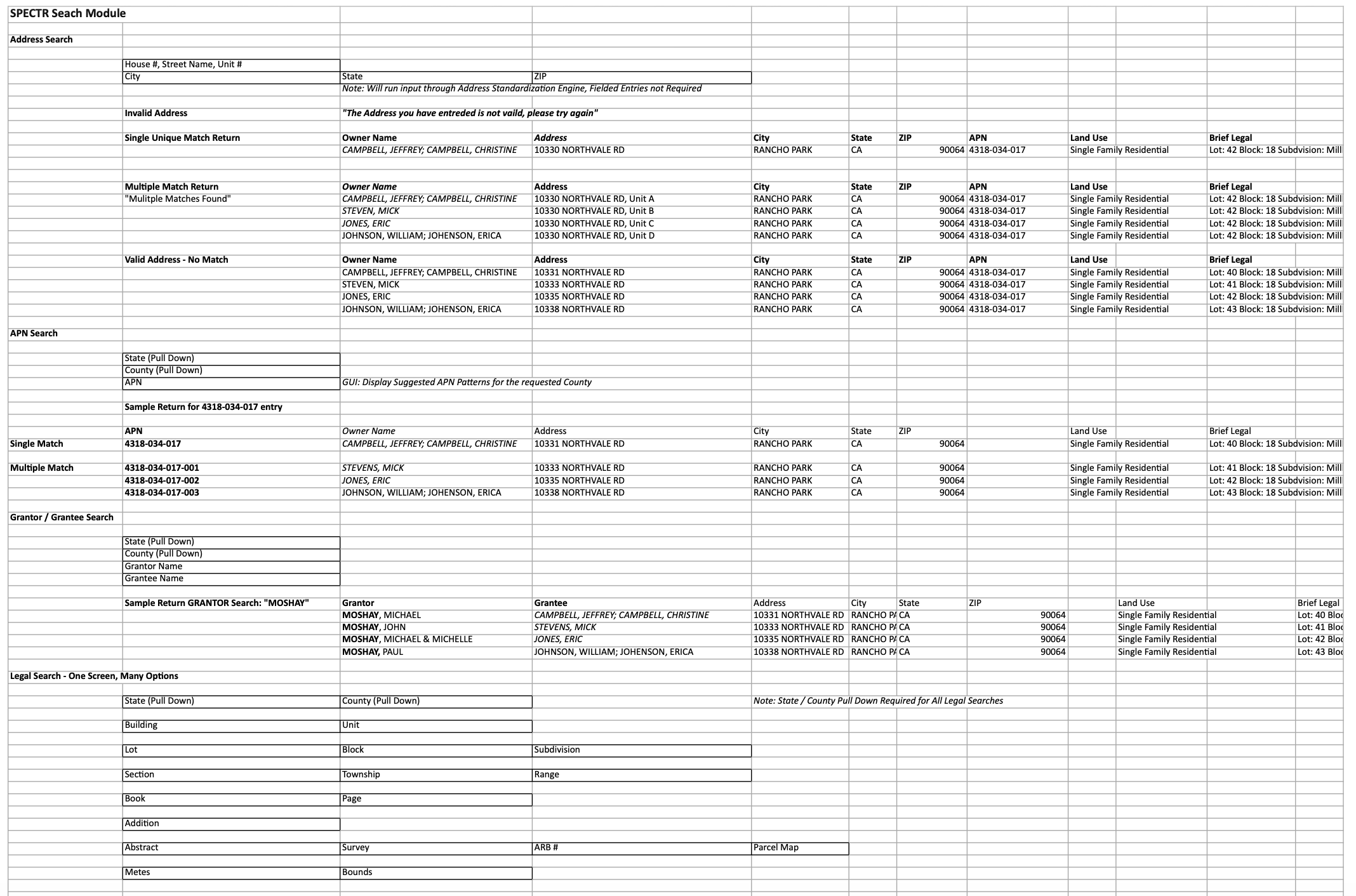
- Stakeholder interviews — Agents requested searches for Address, APN, Signle Match, Multiple Match, Grantor/Grantee, and Legal Search.
- User interviews — Agents said they wanted specific search fields and smarter defaults.
User journey and information architecture
Example user goal: find the correct address for a given property quickly and record the address for the closing file.
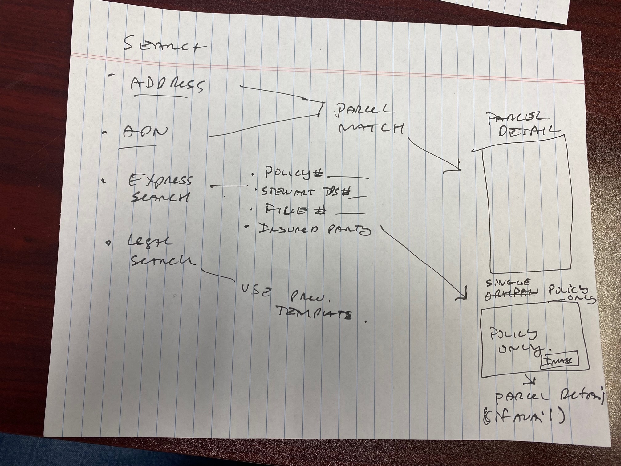
Top IA decision: consolidate search, filters, and address details into a single landing surface to reduce context switches.
Low fidelity design and wireframes
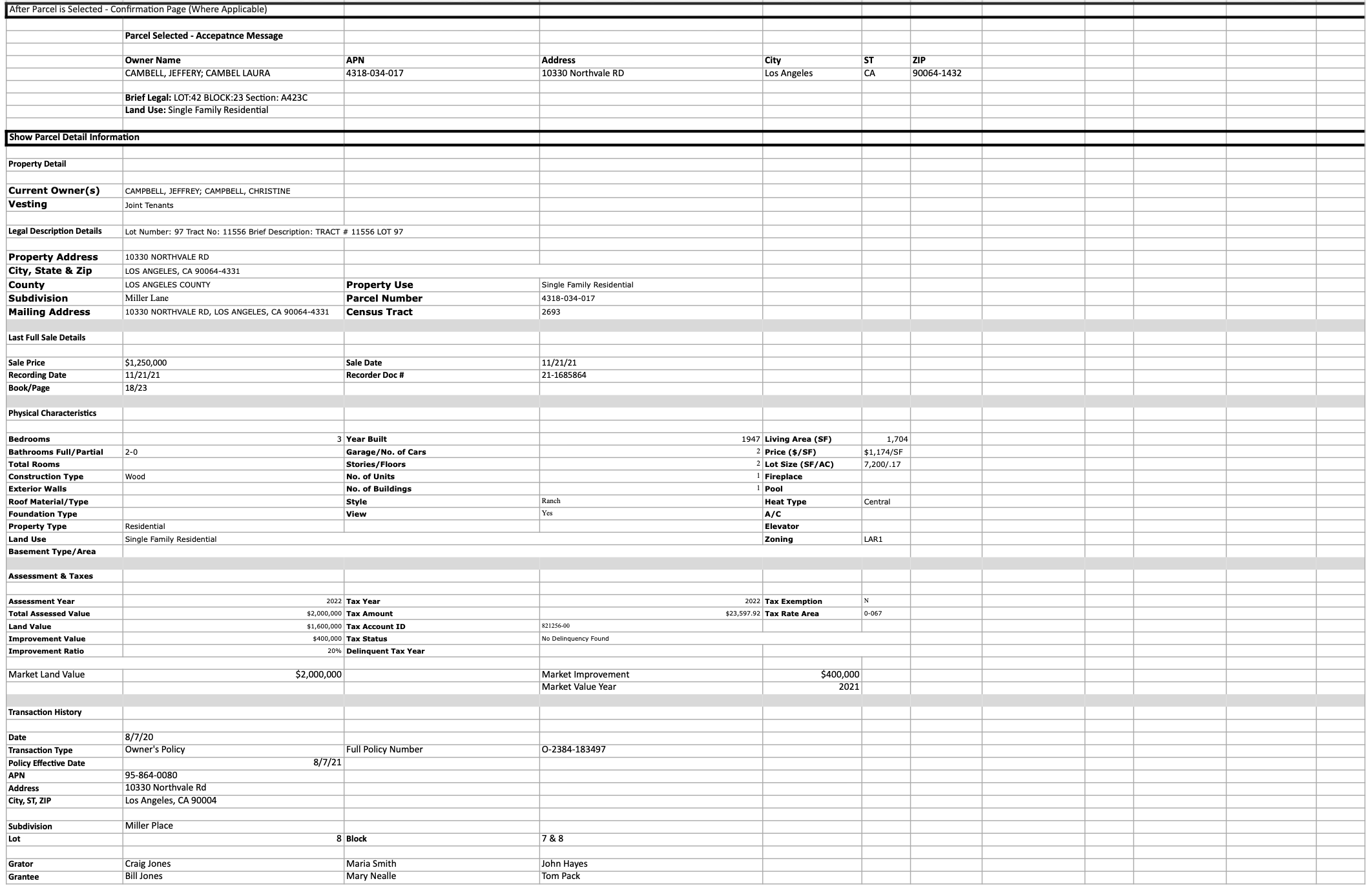
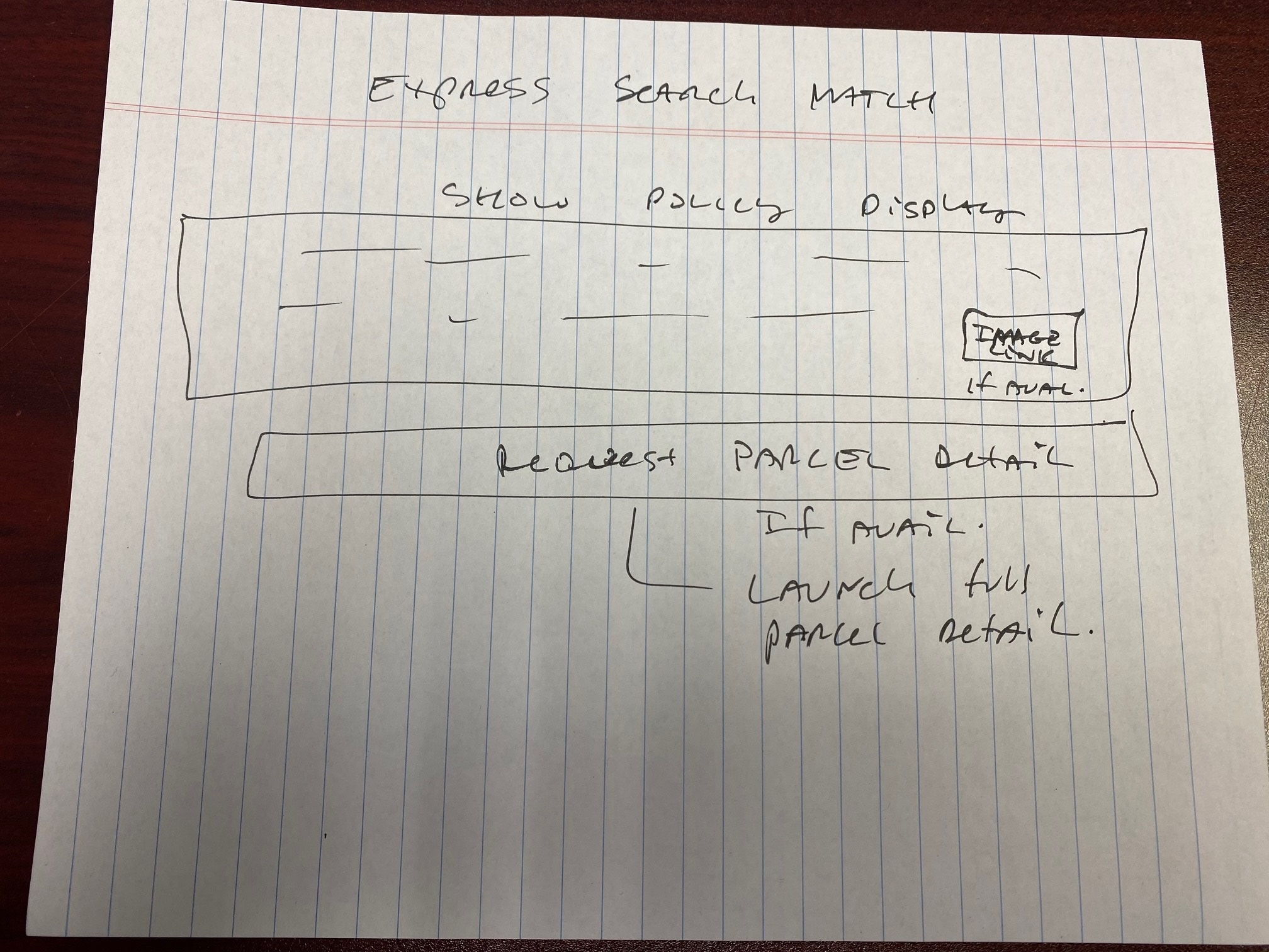
Wireframes focused on reducing steps. I removed redundant fields, prioritized defaults, and source the information shown in context.

High fidelity design and design system
I translated wireframes into a small, pragmatic design system that prioritized consistency and developer handoff simplicity.
Prototype and interaction
Prototype fidelity: medium. Clickable flows covered search to address selection and the results table. Microinteractions prioritized clarity of state and provenance visibility.
Usability testing and iteration
Method: remote moderated testing. Sample: 8 agents. Tasks: find address, record address, explain provenance. Top 3 findings below.
- Default filters were invisible. Fix: show active filter pill.
- Result rows needed clearer affordance to view provenance. Fix: add a badge and drawer.
- Mobile action placement caused accidental taps. Fix: moved primary action to bottom sticky bar.
Developer handoff
Handoff included: component library in Figma, tokens mapped to CSS variables, and a single-file PDF with redlines and accessible annotations.
- Import Figma tokens to shared CSS variables
- Verify color contrast for all interactive states
- Implement keyboard support for inputs and tables
Results and metrics
Measurement method: A/B pilot with 500 agents over 6 weeks. Metrics below show conservative, validated impact.
- Adoption: +80% active agents using new flow
- Time saved: ~2 hours per agent per week on average, measured via time-on-task logs
- Error reduction: 18% fewer address lookup errors recorded in QA logs
Qualitative: stakeholders reported fewer support tickets and agents called the new search "faster and less stressful."
What I would do next
- Ship analytics hooks to measure provenance clicks and refine defaults.
- Expand component coverage to support localization and new product types.
- Run a follow-up usability test focused on enterprise workflows.