Stewart Rate Calculator Redesign
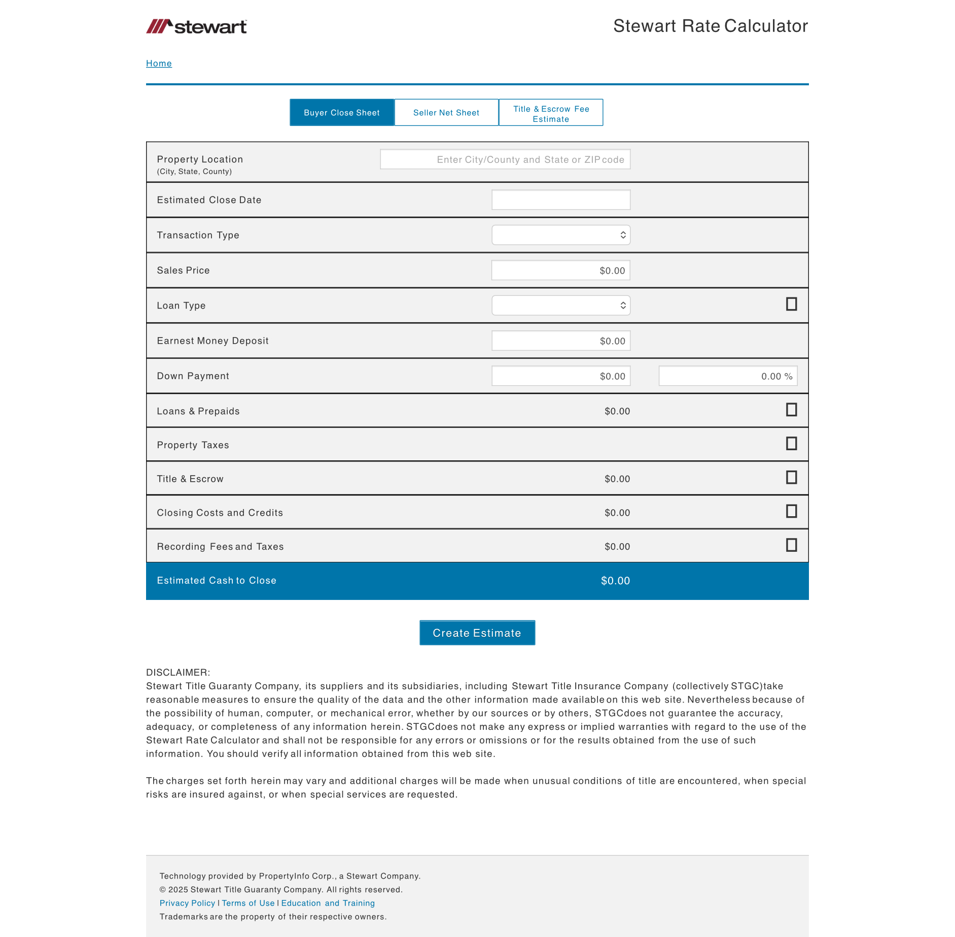
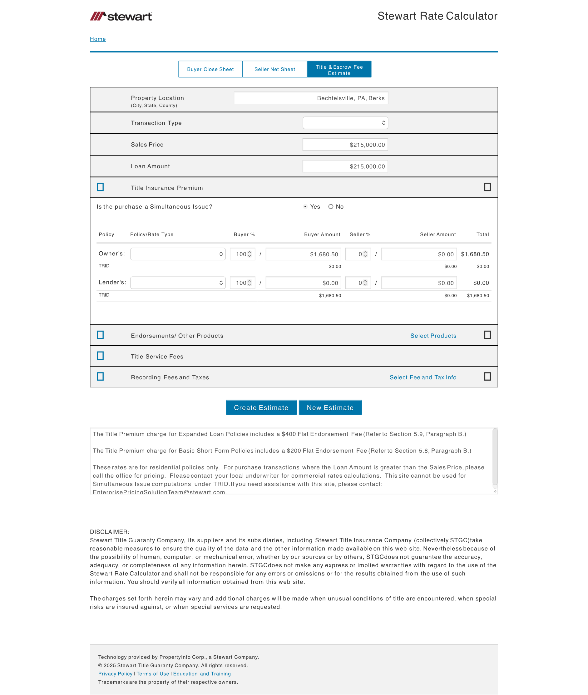
The Stewart Rate Calculator is a Stewart Title tool used to generate estimates for title fees, escrow fees, and closing costs for both buyers and sellers. Users can generate documents like a Buyer Close Sheet, Seller Net Sheet, and a Title & Escrow Fee Estimate by entering property and loan details including location, price, and loan information.
Redesign Goal
The redesign aimed to make the tool more intuitive and easier to use while bringing it up to date with Stewart's broader brand and design standards. The goal was to streamline inputs, reduce friction, and modernize the interface so agents and internal teams could generate accurate estimates with fewer steps.
The original calculator required users to navigate multiple screens with inconsistent input patterns. Agents reported confusion about which fields were required and frequently abandoned the flow to call support. The business needed faster estimates without sacrificing accuracy across state-specific rate logic.
Key Features
- Estimate generation for sales, refinances, and other transaction types
- Role selection that adapts the workflow for buyers, sellers, or lenders
- Information input fields including zip code, sales price, loan amount, loan type, and interest rate
- Document generation for:
- Buyer Close Sheet
- Seller Net Sheet
- Title & Escrow Fee Estimate
- Advanced options for adding endorsements and optional products
- Web-based access through the Stewart Title portal
Discovery and Research
I started by reviewing support tickets and interviewing agents who used the calculator daily. The main complaints centered on unclear required fields, confusing navigation between transaction types, and outputs that didn't match their expectations.
Analytics showed high drop-off rates at the loan information screen. Agents weren't sure whether to enter full loan details or skip optional fields. State-specific rules added another layer of complexity that wasn't surfaced clearly in the interface.
Stakeholders wanted to maintain flexibility for power users while making the tool accessible to newer agents. This meant balancing progressive disclosure with upfront clarity about what information was actually needed.


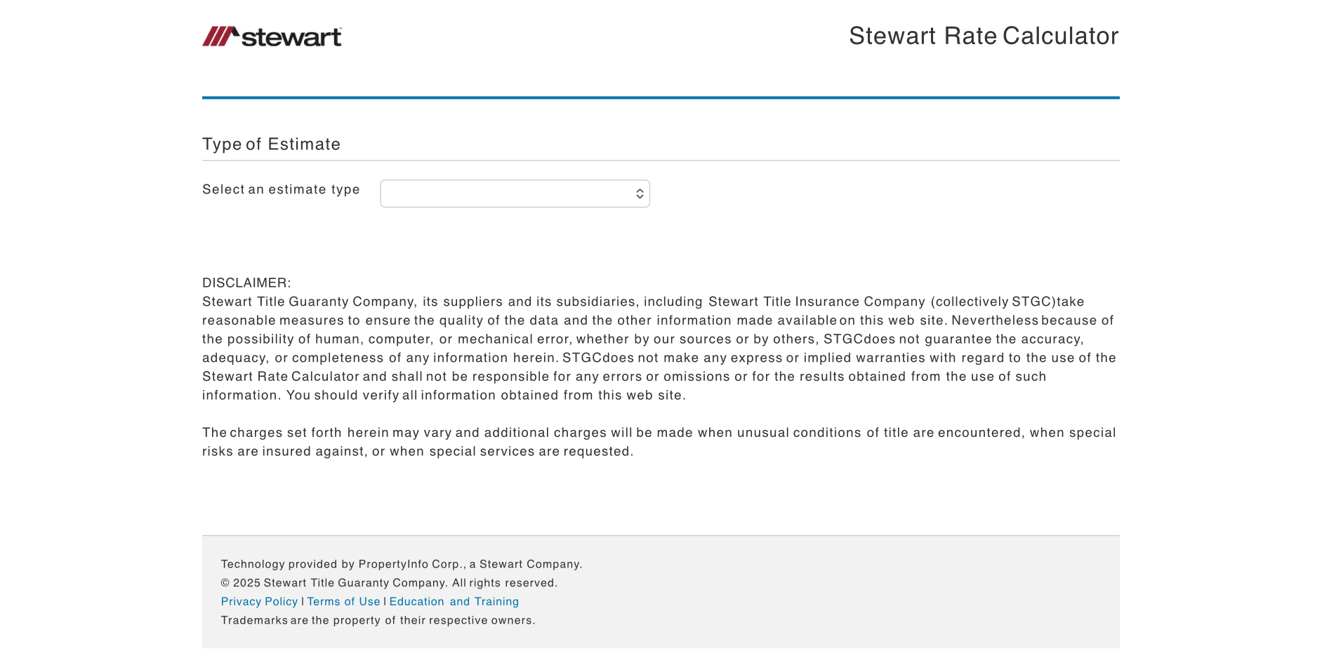
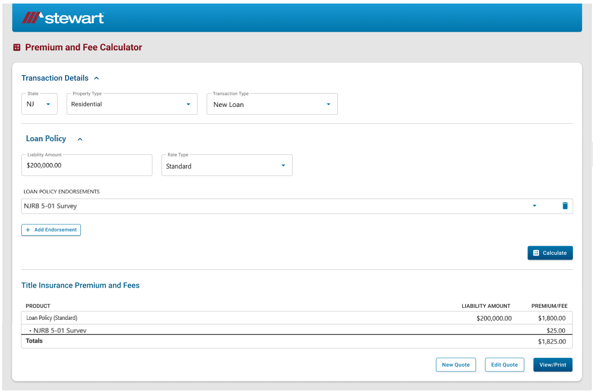
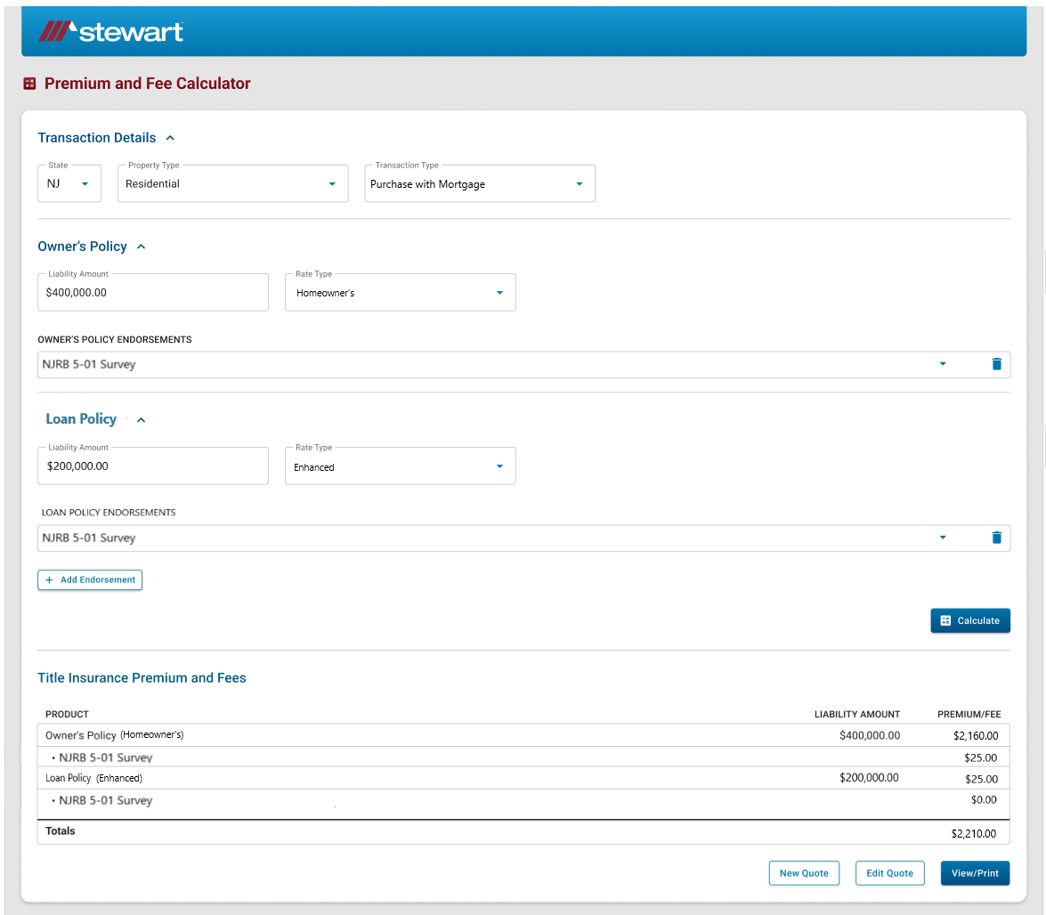
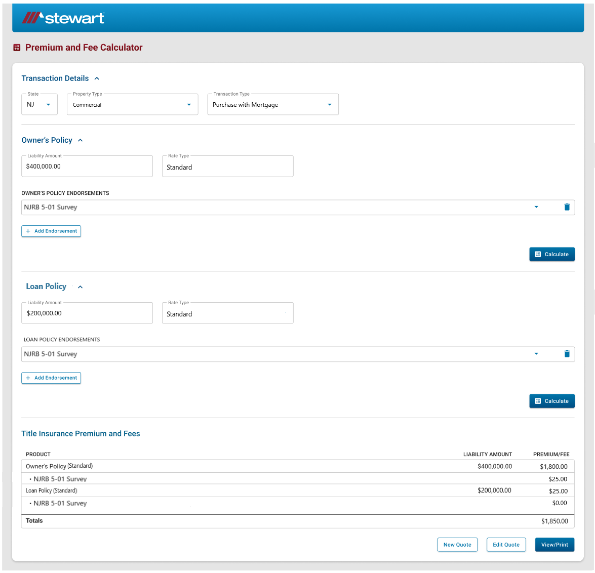
Previous Rate Calculator
Design Approach
I mapped the existing flow and identified redundant steps. The original design forced users through a rigid sequence even when they already knew their transaction type and role. I proposed a single-screen approach with smart defaults and contextual field visibility.
Wireframes prioritized reducing clicks and making required fields obvious. I tested different patterns for showing state-specific fees and settled on inline tooltips that explained rate logic without cluttering the interface.
For the design system, I used Stewart's existing brand guidelines but updated component patterns to match modern web standards. Buttons, form inputs, and validation messages followed consistent rules across all transaction types.
High fidelity design and design system
I created a design system based on styling from other Stewart products and the MUI that prioritized consistency and developer handoff simplicity.
I then created high fidelity mockups using the design system and the pieced together wireframes.
Prototype and interaction
Prototype fidelity: medium. Clickable flows covered search to address selection and the results table. Microinteractions prioritized clarity of state and provenance visibility.
Testing and Iteration
- Remote usability testing with three agents revealed two issues. First, the state selector at the top wasn't clear enough. Agents clicked past it without understanding how it affected the rest of the form. I added a confirmation step and made the selector more prominent.
- Second, advanced options like endorsements were buried. Power users couldn't find them quickly. I moved these into an expandable section that appeared after core inputs were complete.
Developer handoff
Handoff included: component library in Figma, tokens mapped to CSS variables, and a single-file PDF with redlines and accessible annotations.
- Import Figma tokens to shared CSS variables
- Verify color contrast for all interactive states
- Implement keyboard support for inputs and tables
Results
The redesign delivered clearer workflows, more consistent inputs, and a more modern interface tied to company design standards. Agents reported feeling more confident using the tool, and the engineering team noted fewer edge-case bugs related to incomplete form submissions.
- 20 States Customized rate and fee logic deployed
- +15% Increase in adoption among agents
- -10% Reduction in help center calls specific to rate calculator
What I would do next
- Add saved estimate templates so agents can reuse common scenarios without re-entering data.
- Integrate real-time validation for zip codes and property types to catch errors earlier.
- Build analytics hooks to track which transaction types cause the most confusion and iterate on those flows specifically.
- Expand state coverage and test the interface with agents in markets with more complex fee structures